
Changelog
Latest changes, bug fixes, and new component releases
April 13, 2025
March 2025 release
Components
Accordion1.0.0
- BREAKING CHANGE: Updated to Tailwind CSS 4
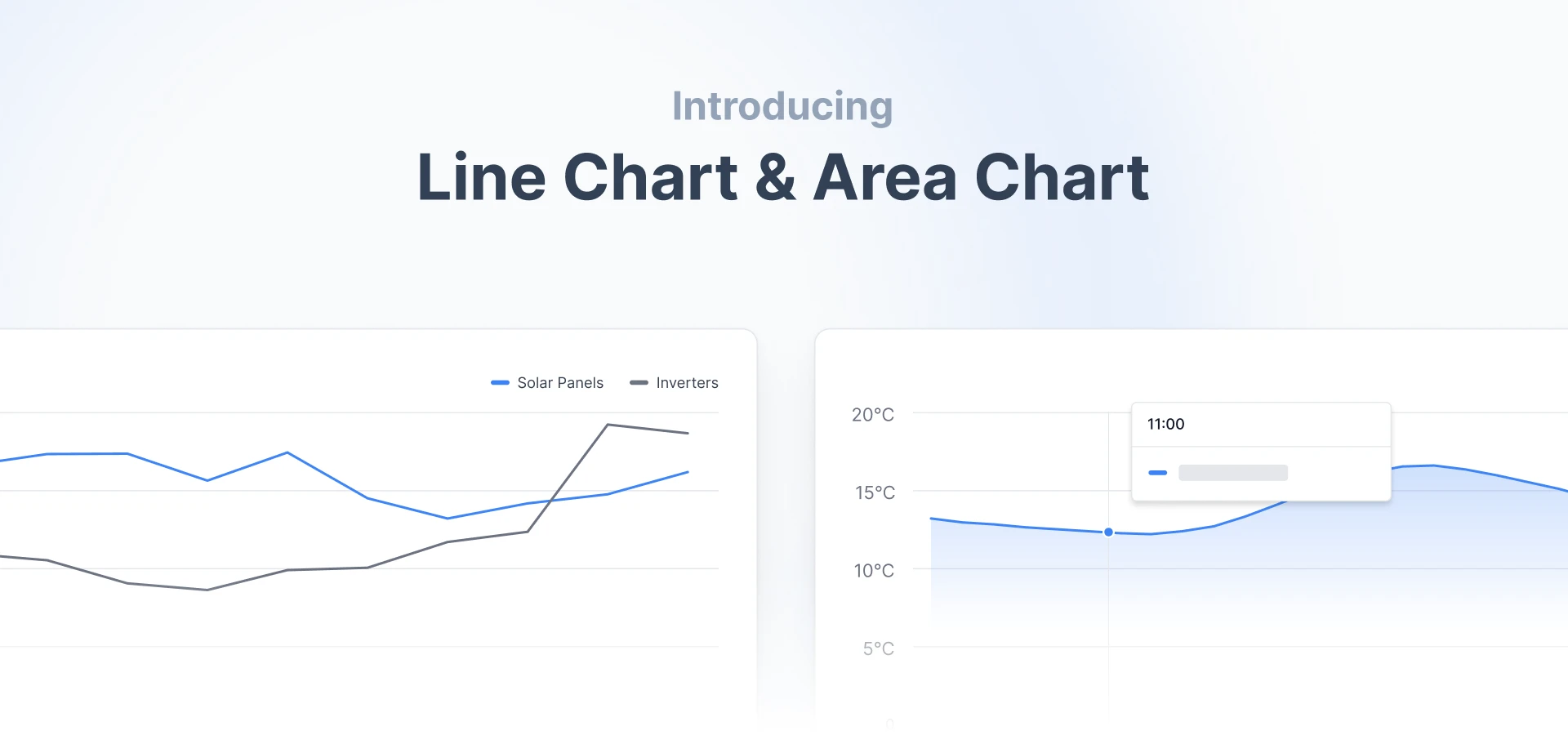
AreaChart1.0.0
- BREAKING CHANGE: Updated to Tailwind CSS 4
Badge1.0.0
- BREAKING CHANGE: Updated to Tailwind CSS 4
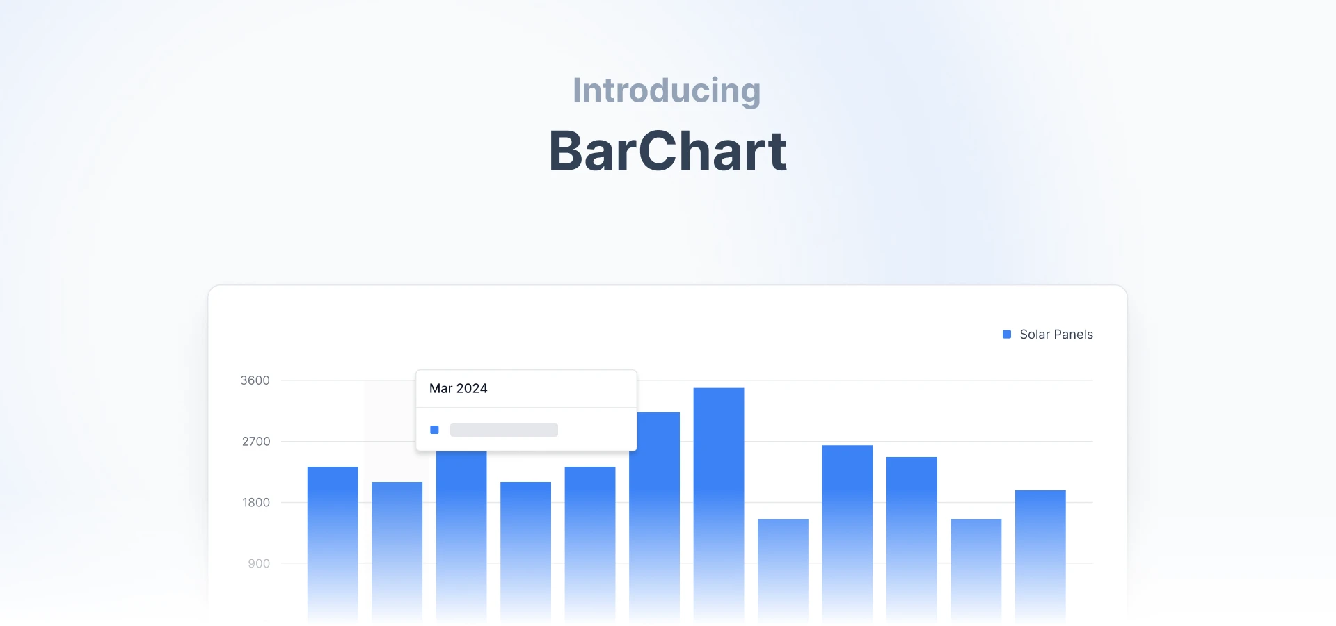
BarChart1.0.0
- BREAKING CHANGE: Updated to Tailwind CSS 4
BarList1.0.0
- BREAKING CHANGE: Updated to Tailwind CSS 4
Button1.0.0
- BREAKING CHANGE: Updated to Tailwind CSS 4
Calendar1.0.0
- BREAKING CHANGE: Updated to Tailwind CSS 4
Callout1.0.0
- BREAKING CHANGE: Updated to Tailwind CSS 4
Card1.0.0
- BREAKING CHANGE: Updated to Tailwind CSS 4
CategoryBar1.0.0
- BREAKING CHANGE: Updated to Tailwind CSS 4
Checkbox1.0.0
- BREAKING CHANGE: Updated to Tailwind CSS 4
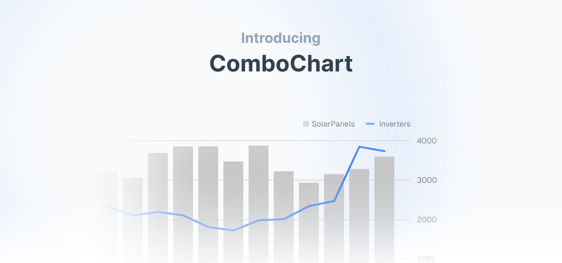
ComboChart1.0.0
- BREAKING CHANGE: Updated to Tailwind CSS 4
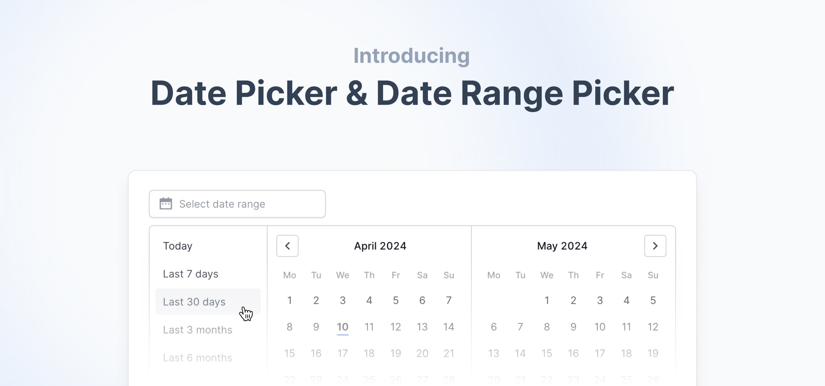
DatePicker2.0.0
- BREAKING CHANGE: Updated to Tailwind CSS 4
Dialog1.0.0
- BREAKING CHANGE: Updated to Tailwind CSS 4
Divider1.0.0
- BREAKING CHANGE: Updated to Tailwind CSS 4
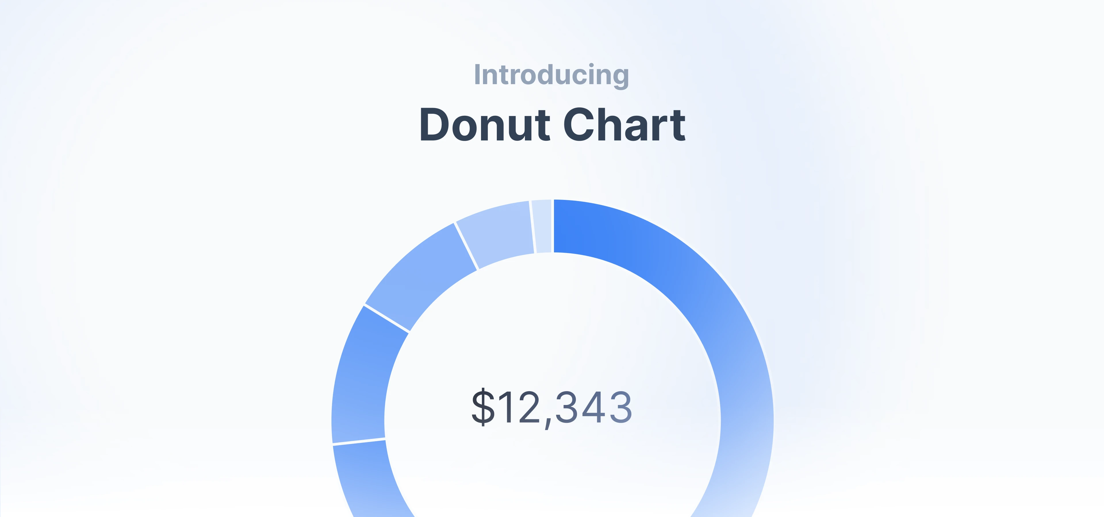
DonutChart1.0.0
- BREAKING CHANGE: Updated to Tailwind CSS 4
Drawer1.0.0
- BREAKING CHANGE: Updated to Tailwind CSS 4
DropdownMenu1.0.0
- BREAKING CHANGE: Updated to Tailwind CSS 4
Input1.0.0
- BREAKING CHANGE: Updated to Tailwind CSS 4
Label1.0.0
- BREAKING CHANGE: Updated to Tailwind CSS 4
LineChart1.0.0
- BREAKING CHANGE: Updated to Tailwind CSS 4
Popover1.0.0
- BREAKING CHANGE: Updated to Tailwind CSS 4
ProgressBar1.0.0
- BREAKING CHANGE: Updated to Tailwind CSS 4
ProgressCircle1.0.0
- BREAKING CHANGE: Updated to Tailwind CSS 4
RadioCardGroup1.0.0
- BREAKING CHANGE: Updated to Tailwind CSS 4
RadioGroup1.0.0
- BREAKING CHANGE: Updated to Tailwind CSS 4
Select1.0.0
- BREAKING CHANGE: Updated to Tailwind CSS 4
SelectNative1.0.0
- BREAKING CHANGE: Updated to Tailwind CSS 4
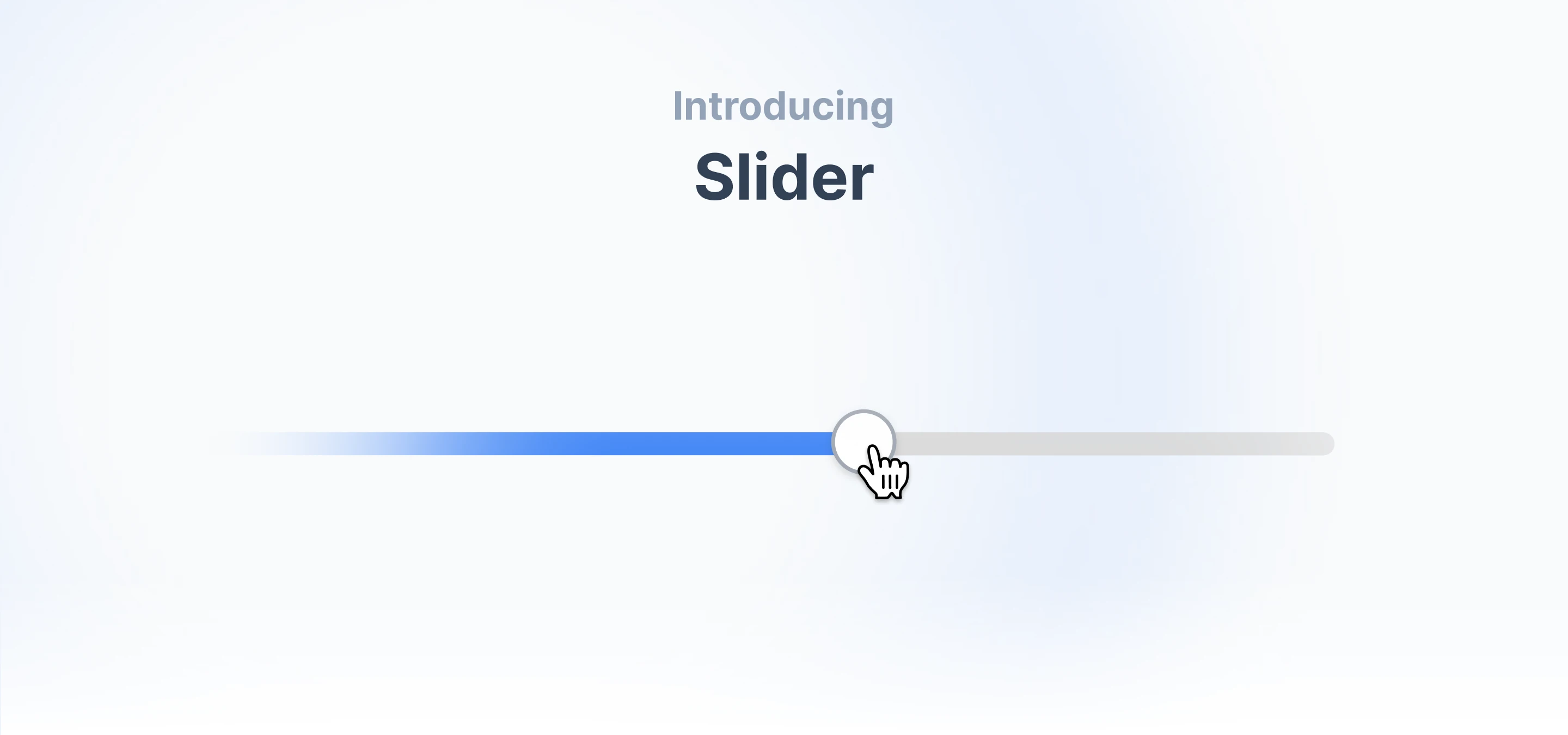
Slider1.0.0
- BREAKING CHANGE: Updated to Tailwind CSS 4
SparkChart1.0.0
- BREAKING CHANGE: Updated to Tailwind CSS 4
Switch1.0.0
- BREAKING CHANGE: Updated to Tailwind CSS 4
TabNavigation1.0.0
- BREAKING CHANGE: Updated to Tailwind CSS 4
Table1.0.0
- BREAKING CHANGE: Updated to Tailwind CSS 4
Tabs1.0.0
- BREAKING CHANGE: Updated to Tailwind CSS 4
Textarea1.0.0
- BREAKING CHANGE: Updated to Tailwind CSS 4
Toast1.0.0
- BREAKING CHANGE: Updated to Tailwind CSS 4
Toaster1.0.0
- BREAKING CHANGE: Updated to Tailwind CSS 4
Toggle1.0.0
- BREAKING CHANGE: Updated to Tailwind CSS 4
Tooltip1.0.0
- BREAKING CHANGE: Updated to Tailwind CSS 4
Tracker1.0.0
- BREAKING CHANGE: Updated to Tailwind CSS 4
Utilities
focusInput0.0.2
- Fix: Variant ordering
useOnWindowResize0.0.2
- Fix: Use a function type instead of a call signature.
Feb 09, 2025
February 2025 release
Components
Toggle0.0.0
- Feat: Toggle and ToggleGroup components
Nov 12, 2024
November 2024 release
Components
ProgressCricle0.0.3
- Fix: Acessibility ARIA roles
ProgressBar0.0.3
- Fix: Acessibility ARIA roles
CategoryBar0.0.3
- Fix: Hidden aria elements
Tooltip0.1.0
- Feat: Replace triggerAsChild with asChild
Oct 30, 2024
October 2024 release
Components
CategoryBar0.0.2
- Fix: Long floating point values
Sept 18, 2024
September 2024 release
Components
ComboChart0.0.0
- Feat: ComboChart component
Input1.0.5
- Fix: Remove redundant input css
Button0.2.0
- Feat: Update base color
Calendar0.1.0
- Feat: Update base color
Slider0.1.0
- Feat: Update base color
TabNavigation0.1.0
- Feat: Update base color
Tabs0.1.0
- Feat: Update base color
RadioCardGroup0.0.3
- Fix: Border color
Aug 17, 2024
August 2024 release
Components
Slider0.0.0
- Feat: Slider component
Calendar0.0.4
- Fix: Z-index day
Utilities
chartColors0.1.0
- Feat: Added lime and fuchsia
July 30, 2024
July 2024 release
Components
Drawer0.0.0
- Feat: Drawer component
DonutChart0.1.0
- Feat: DonutChart component
AreaChart0.3.0
- Feat: customTooltip
BarChart0.2.0
- Feat: customTooltip
LineChart0.3.1
- Feat: customTooltip
- Fix: tooltip payload
Button0.1.1
- Fix: Default height
Calendar0.0.4
- Fix: Default height
- Fix: showOutsideDays logic
Card0.0.1
- Fix: Roundness
Checkbox0.0.2
- Fix: Layout shift
DatePicker1.0.2
- Fix: One export
- Fix: Border style
Input1.0.2
- Fix: Default height
Input0.0.1
- Fix: Typo
Popover0.0.2
- Fix: Border color
RadioCardGroup0.0.1
- Fix: Border color
Select0.0.2
- Fix: Border color
- Fix: Placeholder color
Table0.0.2
- Fix: Typo
TabNavigation0.0.1
- Fix: TabNavigationLink display name
Toast0.0.3
- Fix: Toast description type
- Fix: Variable assignment
Tracker0.1.2
- Fix: Block Displayname
- Fix: Items-center typo
June 24, 2024
June 2024 release
Components
CategoryBar0.0.0
- Feat: Add Category Bar component
SparkChart0.1.0
- Feat: Add Spark Chart component
- Fix: Gradient category id
BarChart0.1.0
- Feat: Add tooltipCallback prop
- Feat: Add Bar Chart component
LineChart0.2.0
- Feat: Add tooltipCallback prop
- Feat: Add legendPosition prop
AreaChart0.2.1
- Feat: Add legendPosition prop
- Feat: Add tooltipCallback prop
- Fix: Gradient category id
- Feat: Fill prop
Button0.1.0
- Feat: Ghost variant
Label0.0.1
- Fix: Label prop name
Tracker0.1.0
- Feat: Hover effect prop
- Fix: Smooth transition between hover cards
- Fix: Switched padding between bars from gap to px.
Textarea0.0.1
- Fix: Legend scroll distance
ProgressCircle0.0.1
- Chore: Animation behaviour
ProgressBar0.0.1
- Chore: Animation behaviour
May 28, 2024
May 2024 release
Components
LineChart0.0.0
- Feat: Add Line Chart component
AreaChart0.0.0
- Feat: Add Area Chart component
Calendar0.0.2
- Fix: Today indicator disabled style
BarList0.1.0
- Feat: Added sortOrder: `none` option
TabNavigation0.0.0
- Feat: TabNavigation
Utilities
chartColors0.0.0
- Feat: Added chartColors utility
getYAxisDomain0.0.0
- Feat: Added getYAxisDomain utility
hasOnlyOneValueForKey0.0.1
- Feat: Added hasOnlyOneValueForKey utility
- Fix: Dot rendering when datapoints are all the same
Apr 25, 2024
April 2024 release
Components
Date Picker1.0.0
- Feat: Date Picker component
- Feat!: Added hh:mm time input
Date Picker1.0.0
- Feat: Date Range Picker component
- Feat!: Added hh:mm time input
Calendar0.0.0
- Feat: Calendar component
Dropdown0.0.0
- Feat: Dropdown component
Input1.0.0
- Fix: File input outline styles
- Fix: Add transition class to Input
- Feat!: Making it full width to behave like a native input
- Feat!: Pulls className into the outer most element and adds an inputClassName prop to pass styles to the nested input
Calendar0.0.1
- Fix: Button Effect issues
- Fix: Icons aria hidden
Mar 30, 2024
March 2024 release
Components
Tracker0.0.1
- Feat: Added onClick event to HoverCard to make tracker appear on touch devices.
BarList0.0.1
- Fix: Improve spacing when bar is a button.
- Fix: Improve padding for long labels.
Toast0.0.1
- Fix: Improve dark mode visbility
Table0.0.1
- Fix: Fix types of table elements: Table, TableHeaderCell, TableCell
Utilities
focusRing0.0.1
- Chore: Updated sort order and added comments
focusInput0.0.1
- Chore: Updated sort order and added comments
hasErrorInput0.0.1
- Chore: Updated sort order and added comments
Mar 27, 2024
Tremor Raw is live
We're excited to launch our first batch of over 20 React copy-and-paste components. Tremor Raw is not a component library. Instead components are available in plain code and can be copied from our website.
This offering complements our Tremor Component Library (NPM Package) and appeals to developers who seek full customization of our components.
